Trendiest Paint Colors from Top Brands
Posted by Jenni Barnett on Saturday, August 12th, 2017 at 8:40am.
A fresh coat of paint can make a space feel instantly new again. With a relatively low cost compared to other major renovations, usually, the biggest thing standing between homeowners and fresh paint is trying to decide on a color. While you should always go with your own personal style, we’ve scoured the internet for some of this years’ trendiest paint colors. Ready, set, paint!

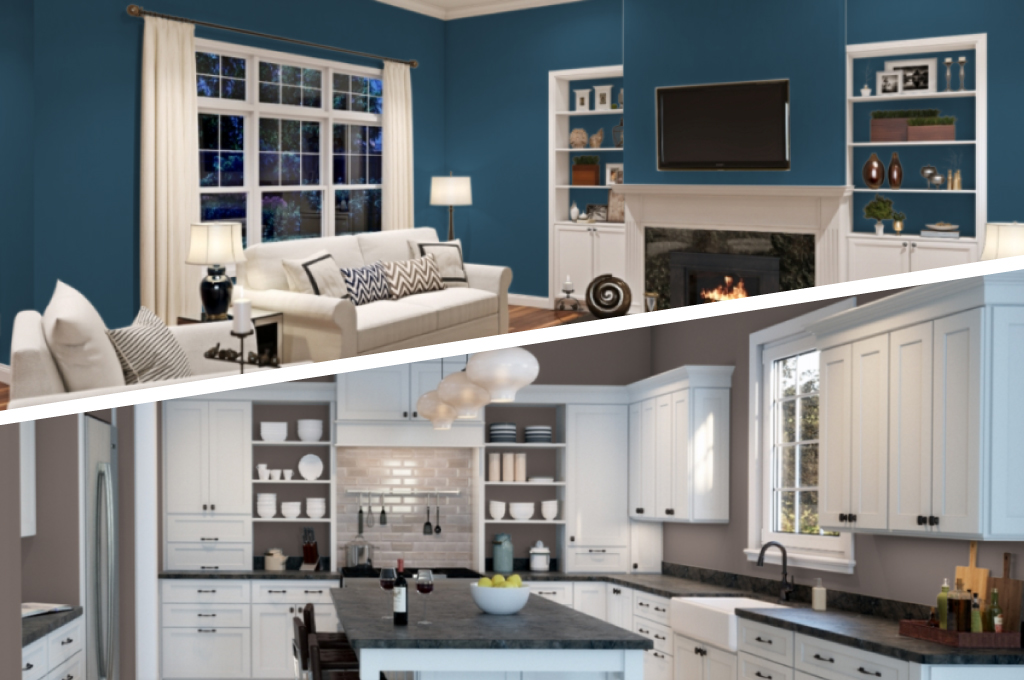
DUSKY BLUE
A blue this rich can bring not just style, but calm into your home with the hue reminiscent of the ocean and the sky at dusk. Depending on what color scheme you’re going for, you can bring in different accent colors. While this is a shady, beach feel – different accent colors will evoke an entirely different feel. This shade is close to Endless Sea by Sherwin-Williams.

A SHADOW ON THE WALL
Looking to add a bit of a contemporary vibe into a traditional setting? Benjamin Moore’s color of the year, Shadow, could be your perfect option. It’s intense, yet soft hue transforms styles old and new with just the right amount of depth. Looking for a foolproof way to jazz up a textured wall? This dark gray could be incredibly classy.

TRY TAUPE
Taupe is a magical neutral that brings out the coolness of gray and the warmth of brown. This mix of the two creates a sense of natural comfort and coziness throughout the calendar. Ideal for when you want to go neutral, but can’t seem to find the perfect shade of a traditional tone. Sherwin Williams’ poised taupe is their favorite color of the year.

CLOUDBERRY
Olympic Paint’s Cloudberry has launched this year as a muted lavender, deemed as versatile as a cool neutral color. Unlike typical lavenders and pinks, designers say to use this just as you would any neutral, avoiding combining it with too many other pastels. With several other paint companies stating their color of the year as a similarly muted lavender, this color is taking off for its middle ground between feminine and masculine without going for a typical neutral.

NATURALLY GREEN
Valspar’s color of the year is crushed oregano. This green is unique with yellow undertones that make it a warm green instead of the usual cool tone. The bright, confident feel of this tone brings energy and boldness to small spaces. With that being said, be sure to test before you paint a whole room. It might be just enough to brighten a room as an accent color.

TIMELESS TINT
If you need a new shade but don’t want to commit to something too dark, Clark+Kensington’s Linen is a popular color that allows you to stray from plain white. The brand is gaining a reputation for its quality products and all colors are offered in paint-and-primer-in-one options so you can save yourself some time and elbow grease.